
October 14, 2026
The best composite decking color is the one that suits the fixed materials around the deck, the amount of direct sun it receives, and the way the space will be used. Start with the house exterior, site conditions, and physical samples. Do not choose a color from a screen image alone.
Composite decking colors should be selected as part of a complete outdoor design. Board colour, surface finish, railings, fascia, steps, landscaping, and lighting affect the final result. A sample that looks right indoors can appear lighter, darker, warmer, or cooler once it is placed outside.
Table of Contents
Compare a composite decking color against the materials that will remain around the deck for years. Siding, brick, stone, roofing, window frames, paving, railings, and large furniture usually have more visual influence than temporary accessories.
Use this checklist before narrowing the color range:
| Site factor | What to assess | Why it affects color selection |
|---|---|---|
| House exterior | Warm or cool undertones in siding, brick, stone, and trim | A board can look out of place when its undertone conflicts with permanent finishes. |
| Sun exposure | Hours of direct sun, shade, reflected heat, and time of use | Color can influence how warm a deck surface feels in direct sunlight; see whether composite decking gets hot in the sun for the site conditions that also affect surface temperature. |
| Deck size | Small balcony, medium patio, or large multi-zone deck | Light and dark surfaces can change how open or defined the space feels. |
| Use pattern | Barefoot use, dining, pets, pool access, or frequent entertaining | The practical choice should fit how the deck is used, not only how it looks. |
| Surroundings | Planting, walls, pavers, water features, and neighboring structures | Landscape and hardscape colors affect how a board appears outdoors. |
| Whole-system details | Deck railing components, fascia, stairs, borders, and outdoor deck lighting | A deck color must work with the visible edges and transitions, not only the field boards. |
Choose two or three candidates after this review. A short list makes it easier to compare samples carefully instead of trying to judge every color at once.

Light, medium, and dark composite decking colors create different visual effects. None is universally best; each works under different site conditions.
| Color range | Visual effect | Good starting conditions | Practical consideration |
|---|---|---|---|
| Light gray, light beige, or pale wood tones | Can make a compact deck feel more open | Smaller yards, darker homes, shaded spaces, and bright coastal-style palettes | Dust, leaf stains, and marks can be more visible on very light solid colors. |
| Medium gray, taupe, and medium brown | Usually provide a balanced transition between house and landscape | Mixed sun and shade, natural gardens, brick exteriors, and everyday family spaces | Medium tones often make it easier to coordinate railings, trim, and furniture. |
| Dark gray, charcoal, and dark brown | Create a stronger edge and a more defined outdoor room | Covered decks, shaded yards, accent borders, and homes with lighter exterior finishes | Dark surfaces can become warmer in direct sunlight and may show pale dust or pollen more clearly. |
| Multi-tonal wood-inspired finishes | Add visual variation without adding a second board color | Large deck fields, mixed exterior materials, and landscapes with varied textures | Compare the full board or several samples, because a small swatch may not show the overall pattern. |
On an uncovered deck, compare light, medium, and dark samples in the same location. Surface temperature also depends on direct sun, airflow, orientation, shade, and heat reflected from walls or paving. Color is one decision factor, not a standalone heat-performance specification.
Match the deck to the home by comparing undertones before matching exact color names. Two grays can differ sharply: one may lean warm and brown, while another may appear blue, green, or charcoal. Browns can lean red, golden, gray-taupe, or deep chocolate.
Use the fixed exterior palette as the reference point:
A close match is not always the best design choice. A controlled contrast between the deck and the home can make stairs, railings, and the edge of the outdoor living area easier to read. For broader layout inspiration, compare the color decision with deck and patio design ideas that suit the available space and the home’s exterior style.

Composite decking color and surface finish must be evaluated together because texture, grain pattern, and sheen change how color is perceived. A board with the same nominal color name can look different when it has a brushed, embossed, matte, or more reflective surface.
Check each sample from normal viewing distance as well as up close. A strong grain pattern can add interest across a large deck, but it may look visually busy in a compact space. A smoother or more uniform finish can look calm, but it may make a large uninterrupted deck field feel flatter.
Do not treat color as proof of slip resistance, surface durability, or heat performance. Those properties depend on the specific board construction, finish, and supporting product information. Confirm them separately for the selected product.
Physical composite decking samples are the most reliable way to assess color before an order is placed. Test the actual finish outdoors, beside the materials that will remain on the project.
For a large deck, evaluate several boards or a larger sample panel where possible. Repeated board pattern, grain direction, and color variation are easier to judge across a wider area than on a small chip.
Two composite decking colors work best when one color remains dominant and the second color has a defined job. The contrast should organize the deck rather than divide it into many small visual areas.
| Two-color approach | Suitable use | Design control |
|---|---|---|
| Picture-frame border | Defines the outer edge of a deck | Keep the field color dominant and repeat the border detail consistently. |
| Stair accent | Separates steps from the main deck area | Use the accent only where it improves the transition or visibility. |
| Dining or seating zone | Distinguishes a large deck area without adding walls | Use a simple rectangular zone that aligns with the board layout. |
| Fascia and trim contrast | Creates a finished edge around the deck | Coordinate the trim with railings or exterior accents. |
Small decks usually need fewer visual changes. A single field color with one compatible trim or railing choice often looks more intentional than several competing board colors.

Color consistency should be managed before production, delivery, and installation. Even when boards share a color name, variations in lighting, surface texture, and manufacturing batches can affect the finished appearance.
For a residential deck, keep one approved physical sample as the reference for the order. For a larger project, document the approved color, finish, board profile, and visible face in the purchase record. Order enough material for the planned field boards, borders, stairs, fascia, and reasonable cutting allowance at the same time whenever practical.
Before installation, inspect boards in natural light and distribute them across the deck according to the approved installation plan. Do not install all boards from one package in a single concentrated area if the product has intentional tonal variation. Follow the current installation instructions for the selected board and confirm any project-specific color-control requirements before work begins.
Most color problems come from choosing too early or evaluating too little context. Avoid these common mistakes:

Choose composite decking colors by testing physical samples against the home, landscape, and daily sun conditions. Compare undertones, texture, and finish together, then use one dominant color and only purposeful contrast. Before ordering, record the approved color, board finish, and visible-face direction so the completed deck matches the design decision. Request physical composite decking samples before making a final selection.

Light and medium composite decking colors often make a small backyard feel more open. The best choice still depends on the house exterior, available sunlight, and whether the space needs a clear visual edge.
Dark composite decking colors can feel warmer than lighter colors in the same direct sunlight. Shade, airflow, board orientation, reflected heat, and time of day also affect surface temperature, so test samples at the site.
Medium brown, medium gray, and subtle multi-tonal finishes often make ordinary dust and outdoor debris less noticeable than very dark or very light solid colors. Local soil, pollen, leaves, and pet use should guide the final choice.
Yes. Use one color for most of the deck and reserve the second for a border, stairs, fascia, or one defined zone. This keeps the design organized and easier to coordinate with the home.
Composite decking does not need to match either one exactly. A coordinated contrast often gives the deck better definition. Compare samples with the house exterior, railings, trim, and paving before finalizing the color.
A decking sample can look different across a full deck because outdoor light, viewing distance, board texture, grain variation, neighboring materials, and the size of the installed area all affect color perception. Review several samples or a larger panel in the intended location before ordering.

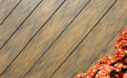
Can You Put Composite Decking Over Existing Wood Deck?

How Much Does a 20 x 20 Composite Decking Cost in 2026?
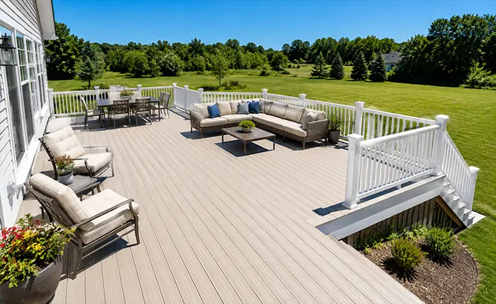
What Is The Best Decking Material For Full Sun?
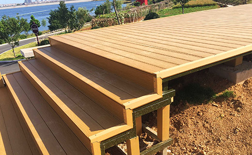
Why Does Composite Decking Warp and How to Fix It?
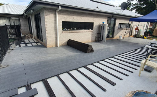
Can You Just Replace Deck Boards with Composite?
How to Building a Pool Deck Around an Above Ground Pool
 How to Evaluate a Composite Fencing Manufacturer
 How To Deal With Standing Water On Decking?
 Shou Sugi Ban-Style Cladding: A Distinctive Finish for Exterior Walls
 What to Put Under The Deck for Moisture?
